
Role
Product Designer
Team
PM, Technical Lead, User Researcher
Focus
Retention & habit formation
Outcome
Following my departure the team shipped iterations of the work in February. An A/B test demonstrated clear impact within the first week
The Problem
Despite strong editorial content, early engagement was poor:
~50% of users opened the app only once
53% never reached an article during their first session
56% didn't scroll to view all 8 articles
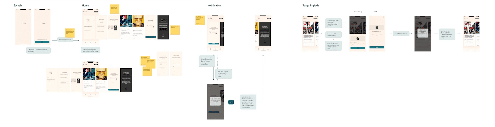
discovery & alignment
To align product, editorial and engineering:
I framed solutions by effort vs impact
Narrowed the problem to communication not content volume
Integrated feasibility early to avoid over-designed solutions
This allowed us to focus on changes that could be tested and shipped.

design direction
Key ideas & decisions:
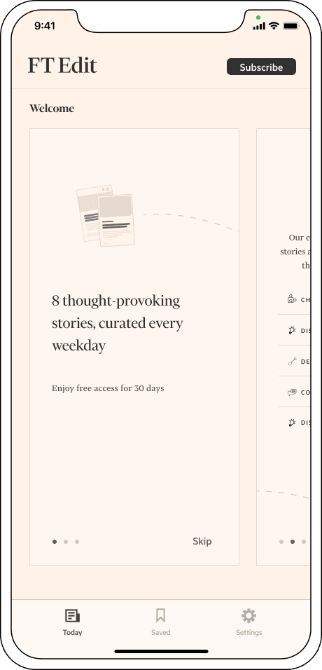
Embedding onboarding within the carousel rather than gating access
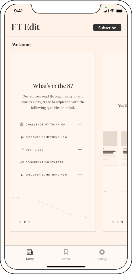
Separated instructional cues from editorial content
Introduced lightweight signals to set expectations
Evolved existing components to minimise engineering risk


This approach balanced two competing needs:
Helping new users quickly understand why the app exists
Avoiding friction that blocked users from reaching articles
a key decision
Internal stakeholders wanted to retain the value-proposition splash screen. However, behavioural data showed a 12% drop-off at this step.
Rather than removing the content entirely, I proposed embedding the value statements directly into onboarding. This preserved editorial intent, while reducing friction and enabling faster exploration.
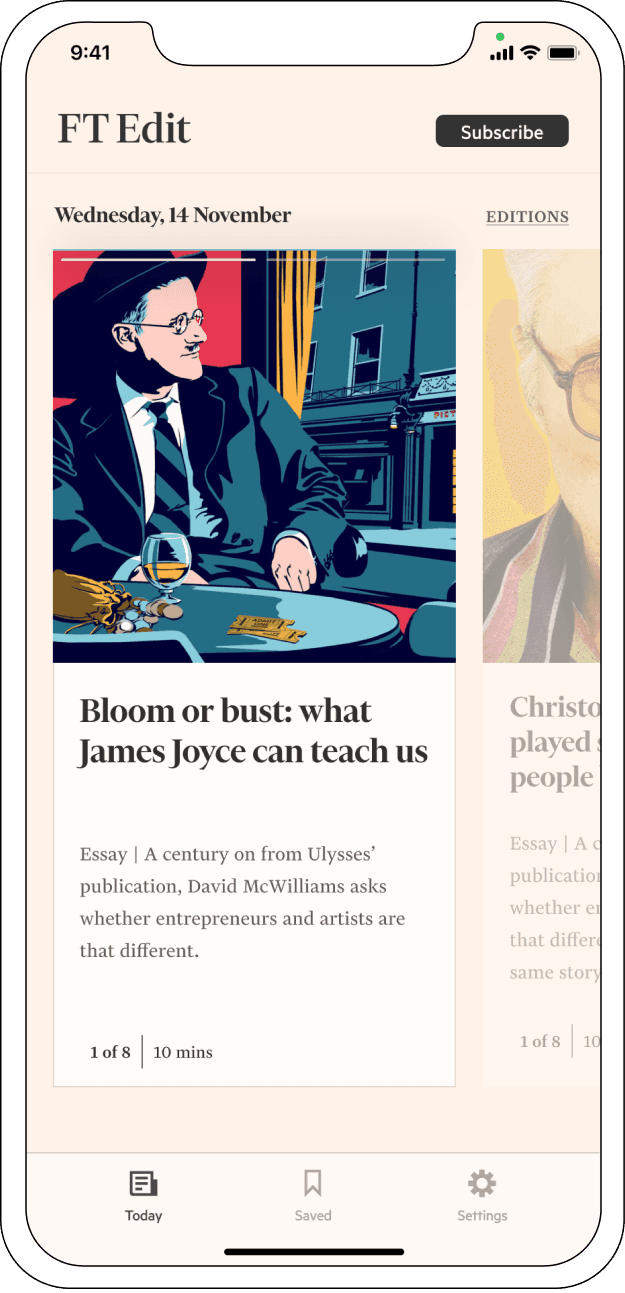
before
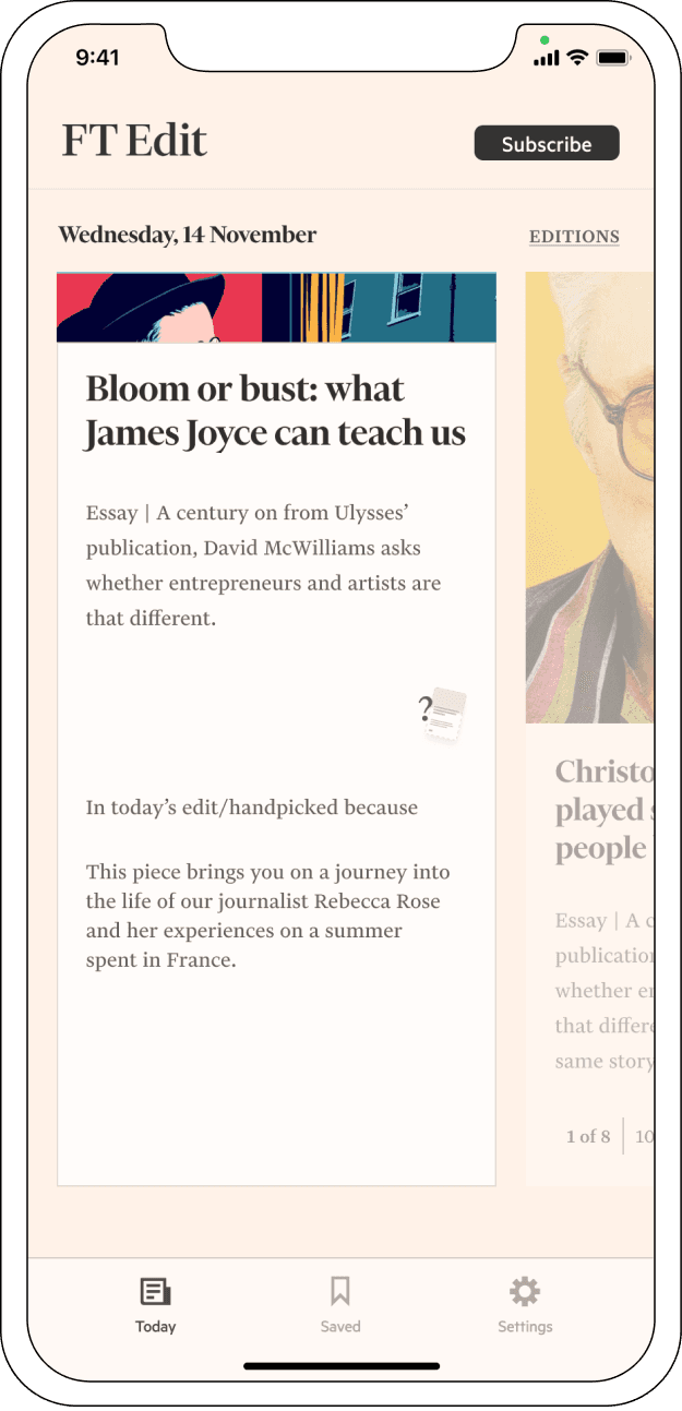
after
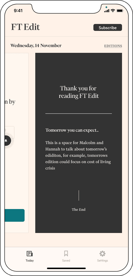
final design
With the structural changes agreed, I led a cross-functional review of the onboarding copy and content to ensure the experience felt intentional rather than repetitive.
We reduced duplicated messaging, tightened narrative flow and aligned editorial tone with behavioural intent. The result was an experience that clarified value without over explaining it


measuring success
To support effecient decision-making, I mapped user-flow scenarios across key user types, aligning product, data and engineering on:
What success looked like
What could realistically be measured
What changes justified testing

What this project changed for me
This work reinforced the importance of:
Establishing shared risk tolerance early
Translating both business & user insights and requests into a clear design brief
Treating onboarding as a system, not a screen