Reframing a Website Redesign into a Strategic Platform & Workflow Project
key outcomes

REFRAMING THE BRIEF
What began as a CEO-led redesign request quickly revealed a deeper product problem.
The front end was only part of the issue. Behind it sat content workflows, ticketing constraints, CMS complexity and operational workarounds that were shaping the experience just as much as the interface itself.
I reframed the project around those underlying systems, helping turn a visual brief into a more scalable platform initiative.
Notable issues
Key information was harder to scan, core journeys lacked distinction and patterns lacked consistency.
Why this happened
The platform had evolved under delivery pressure, expanding incrementally across venues with structure and workflows adapting over time.
What it meant
Navigating the site became less clear, while content and ticketing teams faced more complexity behind the scenes and future changes became harder to scale.
One survey response captured the problem clearly, the experience felt harder to use than it had before.
“Can’t be specific, but found was easier when it was managed by the theatre itself.”
creating ambiguity into direction
The roadmap lacked clear direction, stakeholder expectations varied and the work had not yet been framed in a product-led way.
With limited budget, patchy tooling and unreliable journey data, I built a lightweight discovery approach to create enough confidence to define the problem properly.
This combined stakeholder input, behavioural analysis and IA research, alongside a CRM-supported survey programme that I bootstrapped through Microsoft Forms, spreadsheets and targeted outreach. That work generated 8,173 responses and a much stronger evidence base for understanding friction, audience behaviour and growth opportunities.
I used AI as a synthesis tool to process fragmented evidence more efficiently, then turned the findings into an executive summary for directors and the CEO. This helped reframe the redesign around the clearest opportunities: mobile booking, discoverability and structural improvements across the platform.
Methods: Competitor analysis, surveys, content audits, GA, Clarity, funnel review, card sorting and tree testing
Content structure, or the lack of it, had become a delivery constraint.
The legacy CMS setup was too fragmented to support new feature work cleanly, creating operational overhead and limiting how the platform could evolve.
Improving it reduced duplication, eased manual effort and gave us a safer path through migration, launch and future delivery.
Restructuring foundations behind the interface
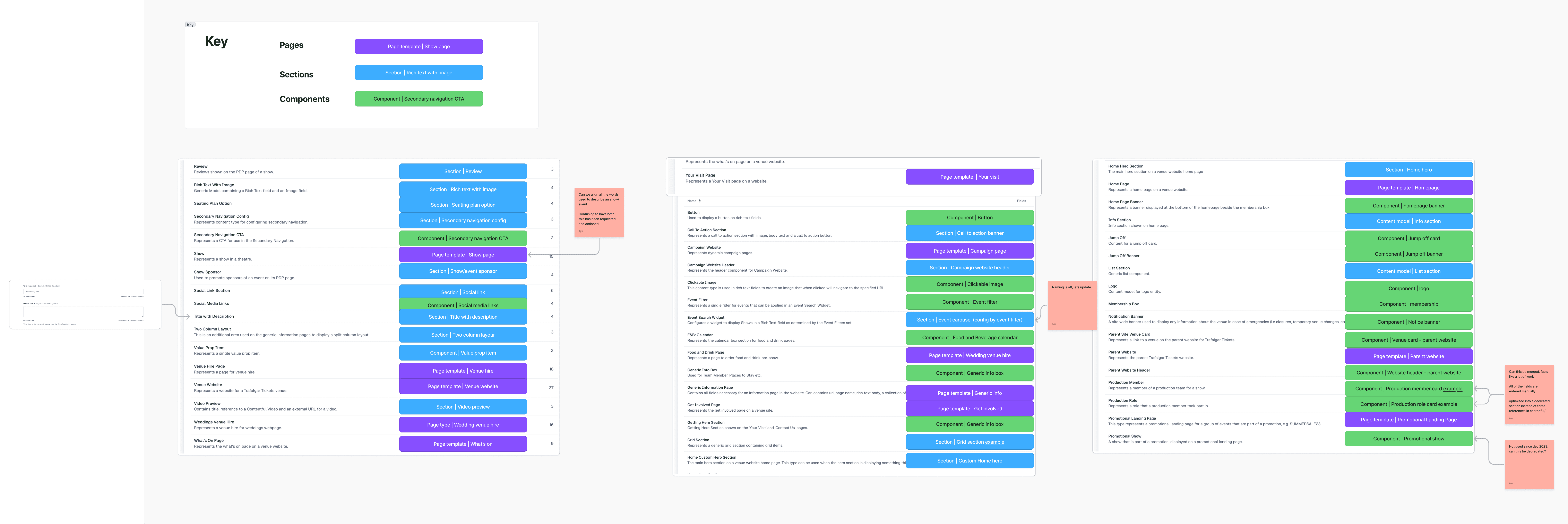
A major part of the redesign sat beneath the interface. The CMS structure had become too fragmented to scale, with model sprawl making it harder to introduce new features, manage content consistently and evolve the platform within the limits of the existing setup.
I mapped the legacy setup to identify where content types, templates and front-end patterns had drifted apart, creating a shared view of where consolidation and deprecation were needed.
This was not a one-off audit. I worked closely with the tech lead throughout the redesign to review deprecations, test structural decisions against delivery needs, and keep the CMS and front-end library moving towards a more maintainable shape.
The result was a simpler foundation that reduced duplication, supported migration and launch more safely, and created more room for future feature work.Audited content models and fields
Image: Mapping legacy content types to front-end patterns to guide consolidation and deprecation
designing for clarity and scale
Alongside the CMS improvements, the interface needed to become clearer, more consistent and easier to extend across venues.
I focused on strengthening hierarchy, reducing one-off design decisions and building more reusable patterns across key page types. The goal was not novelty, but a platform that was easier to navigate, easier for teams to manage and more scalable as the business evolved.
Navigation & structure
Improved hierarchy made key journeys easier to scan and navigate.
Reusable design patterns
Stronger component logic reduced inconsistency and supported reuse across venues.
Visual refresh
A more flexible visual system helped the sites feel less corporate while better reflecting live entertainment.
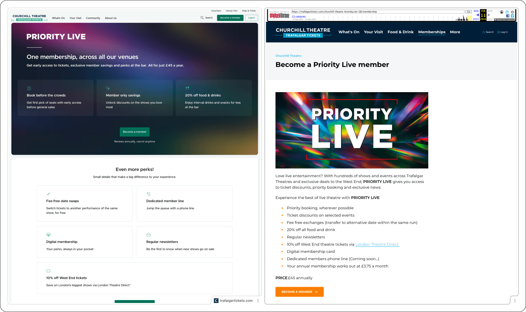
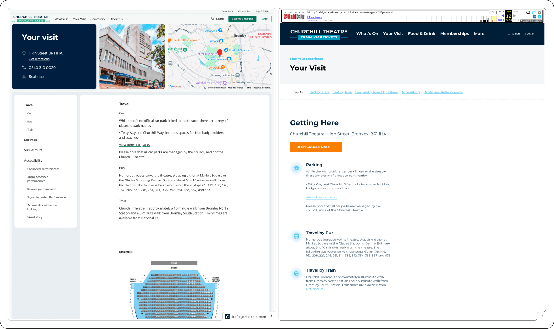
before & after
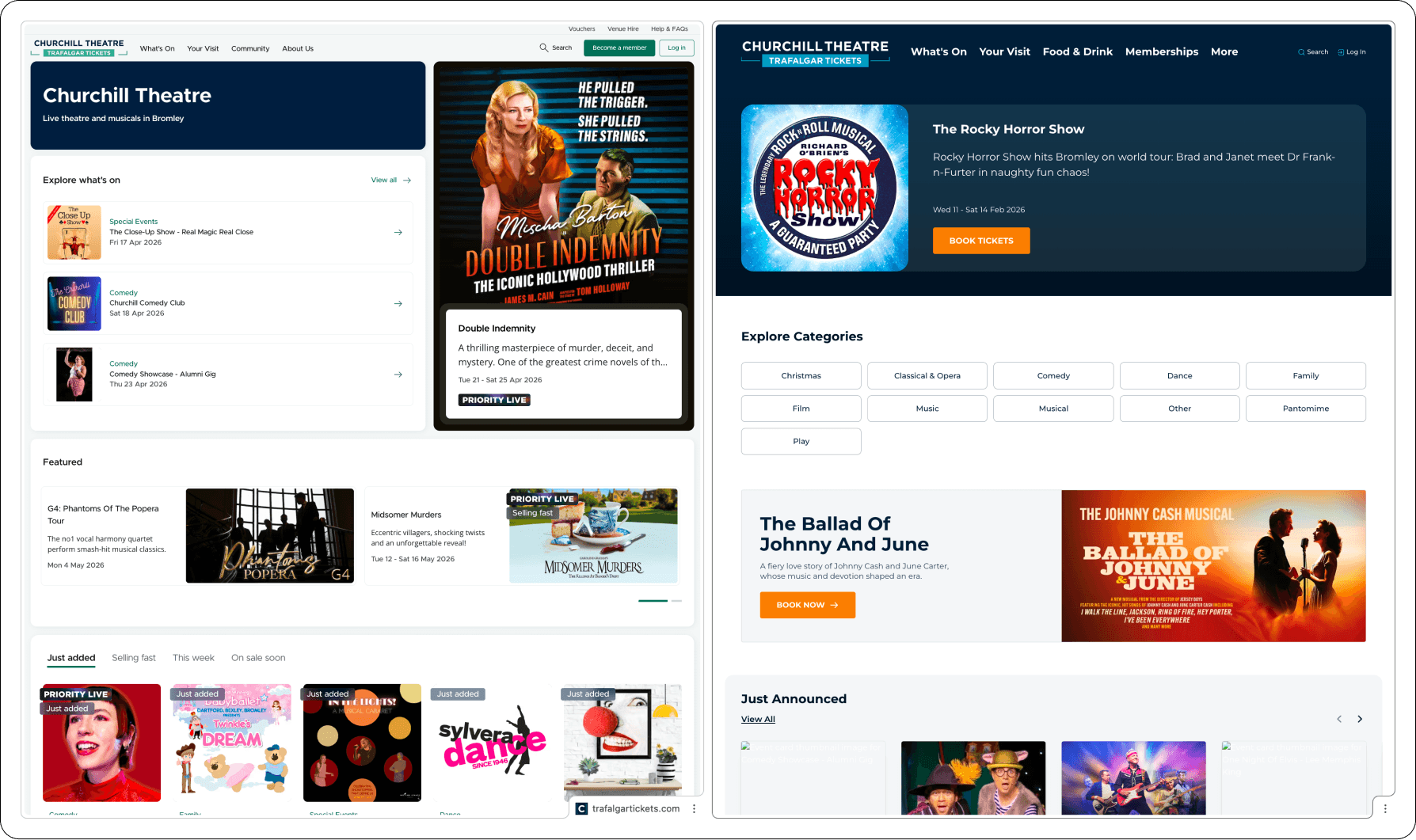
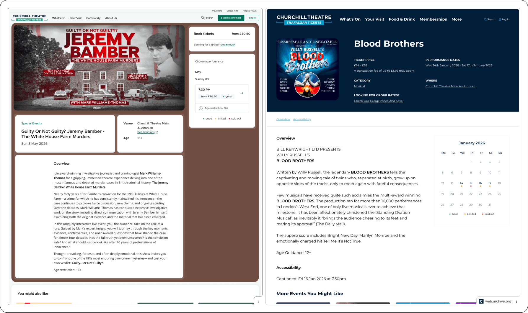
These comparisons show the redesign across four key page types, homepage, membership, event page and Your Visit and how the work improved more than aesthetics, creating clearer journeys, stronger reuse and a platform that was easier to manage and scale.
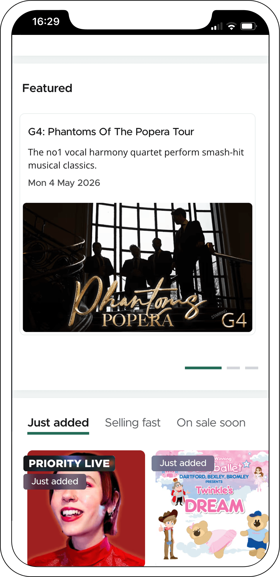
the Mobile experience
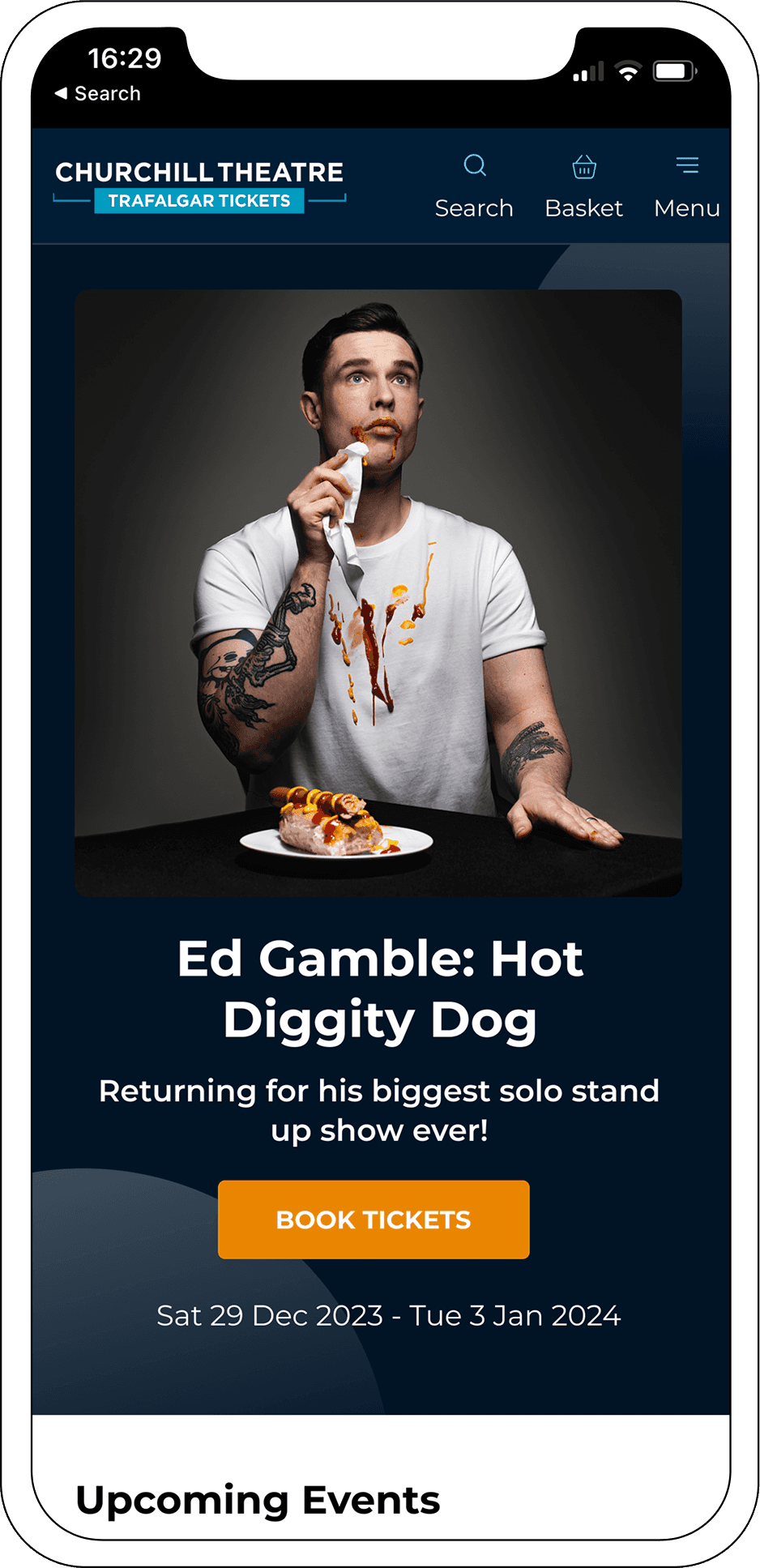
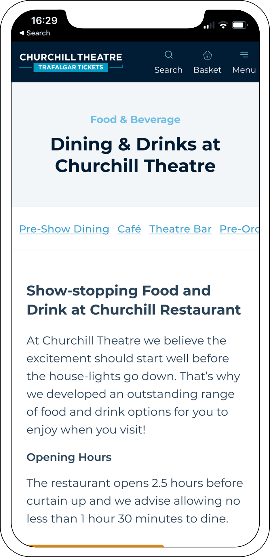
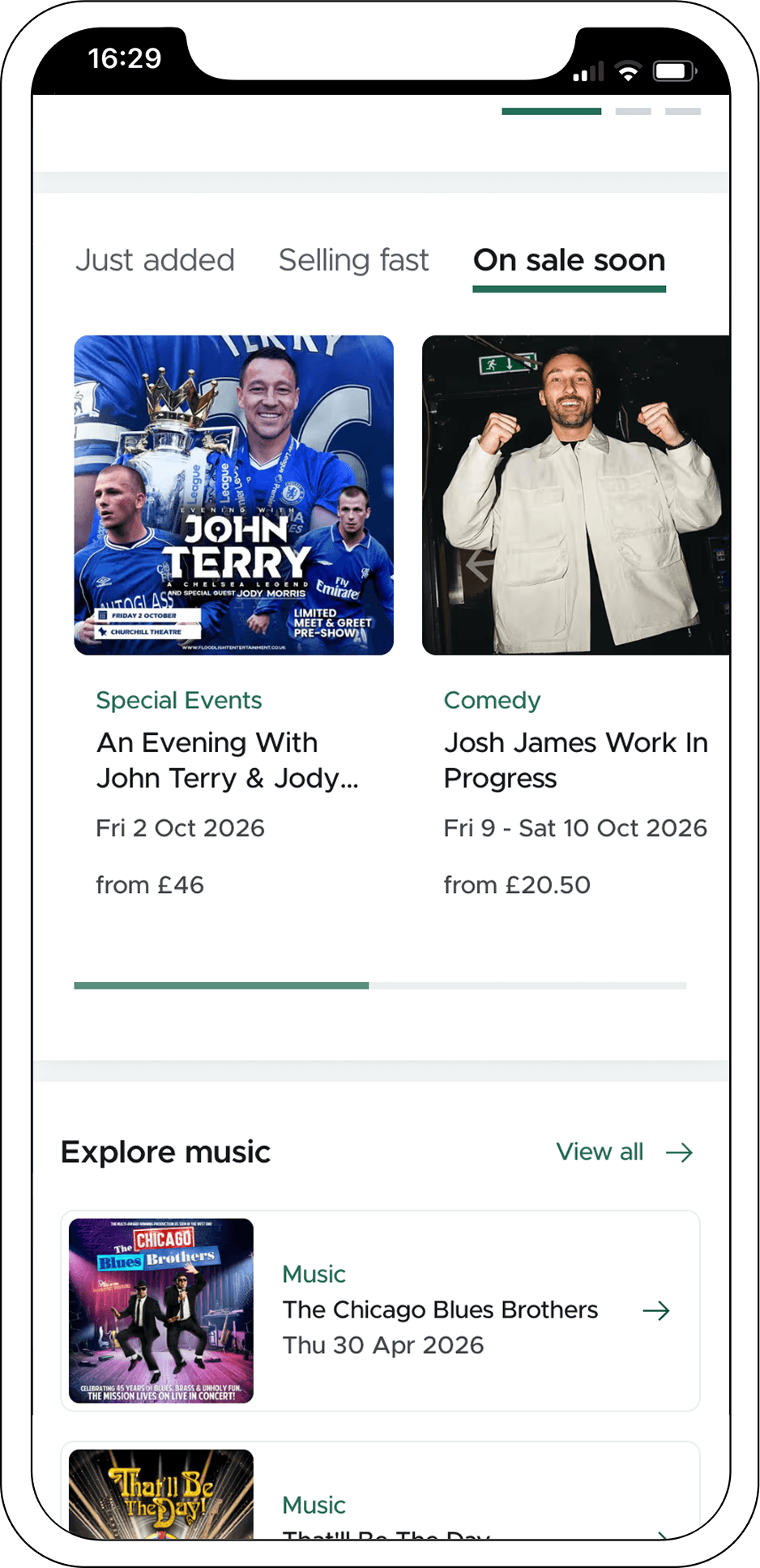
Improving homepage discovery
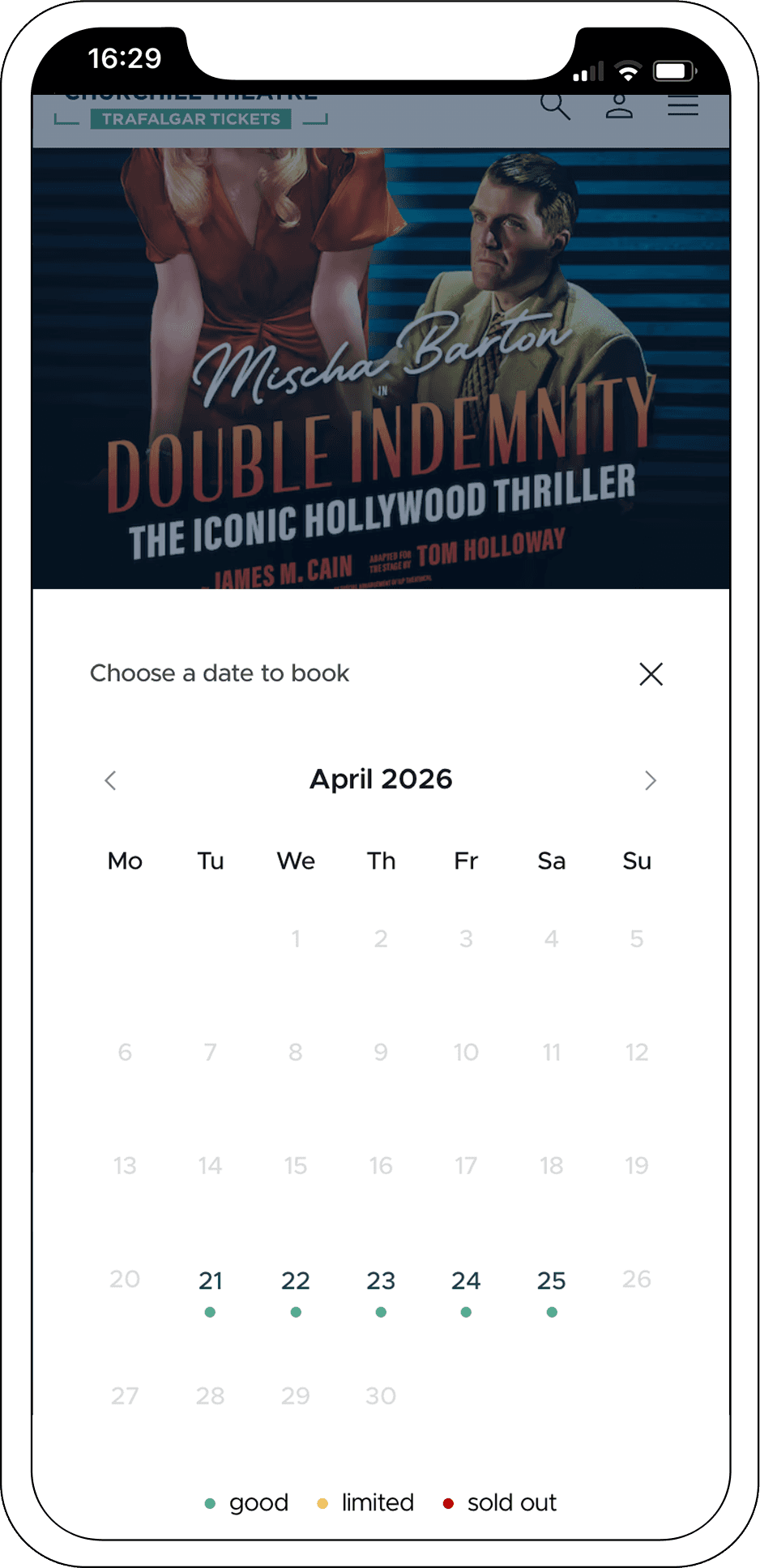
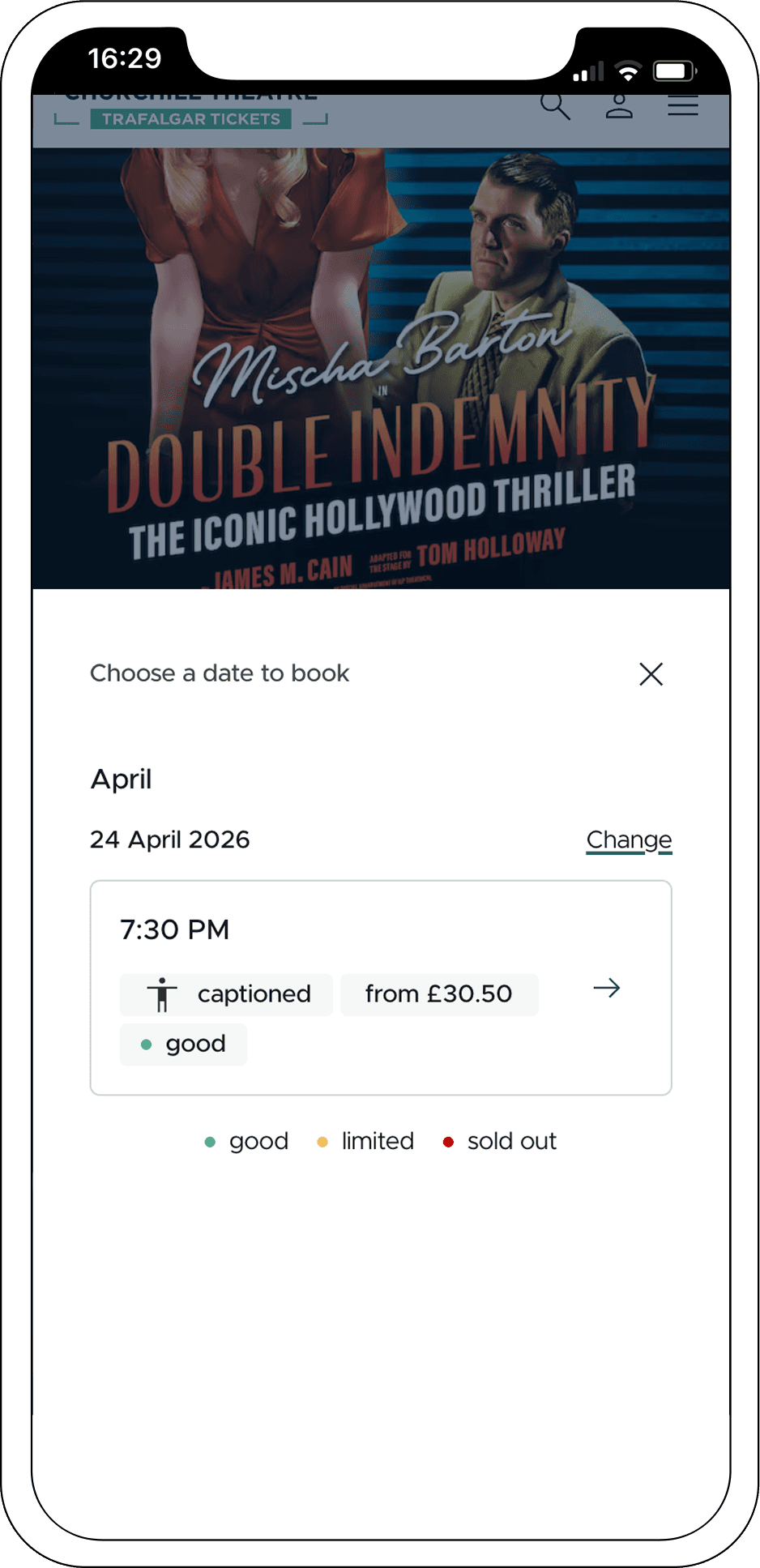
Homepage discovery became easier to scan, with clearer content priority, stronger separation between sections and more deliberate paths into what’s on and categories
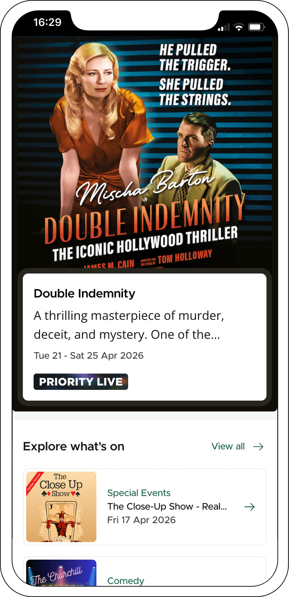
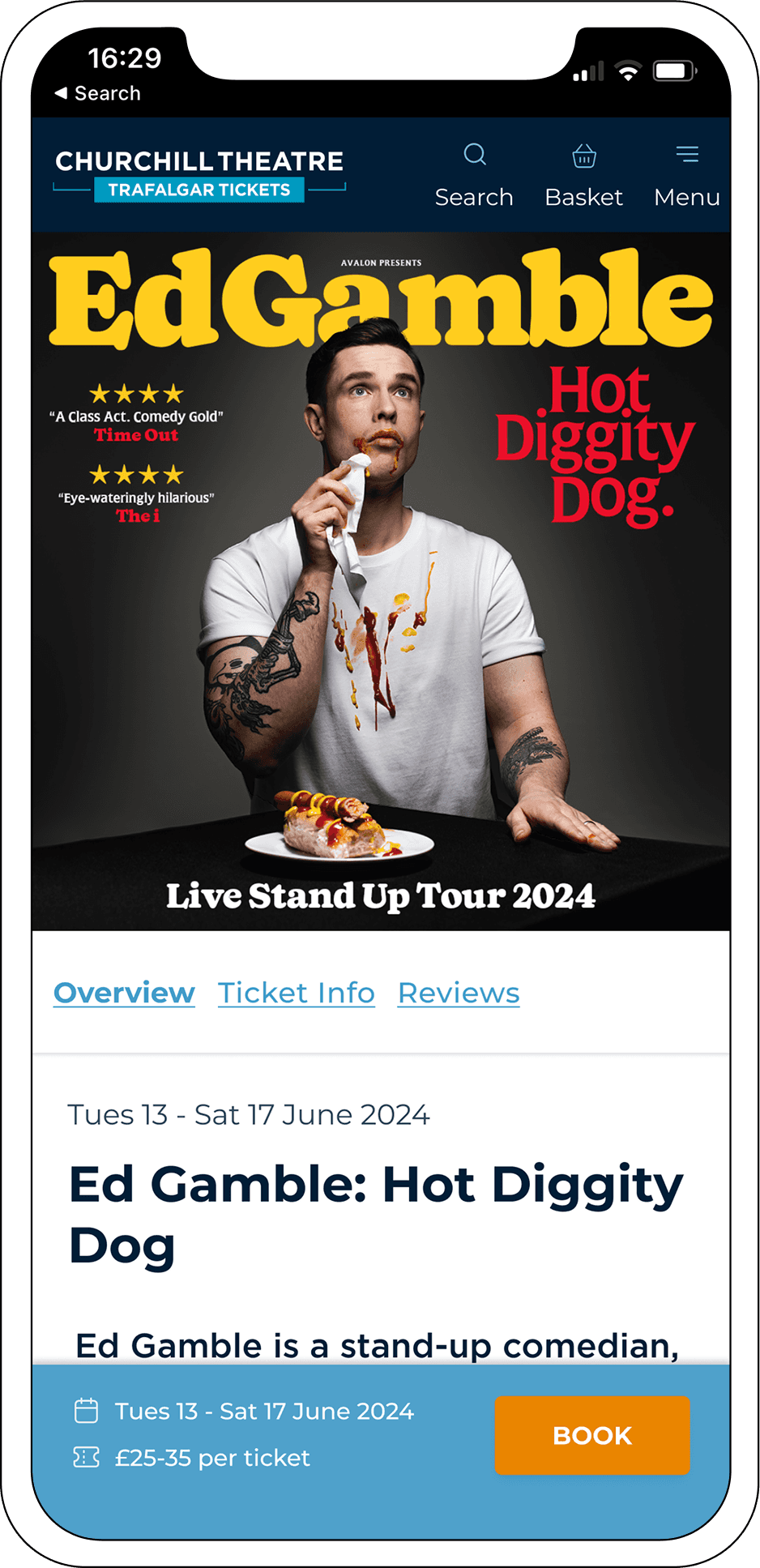
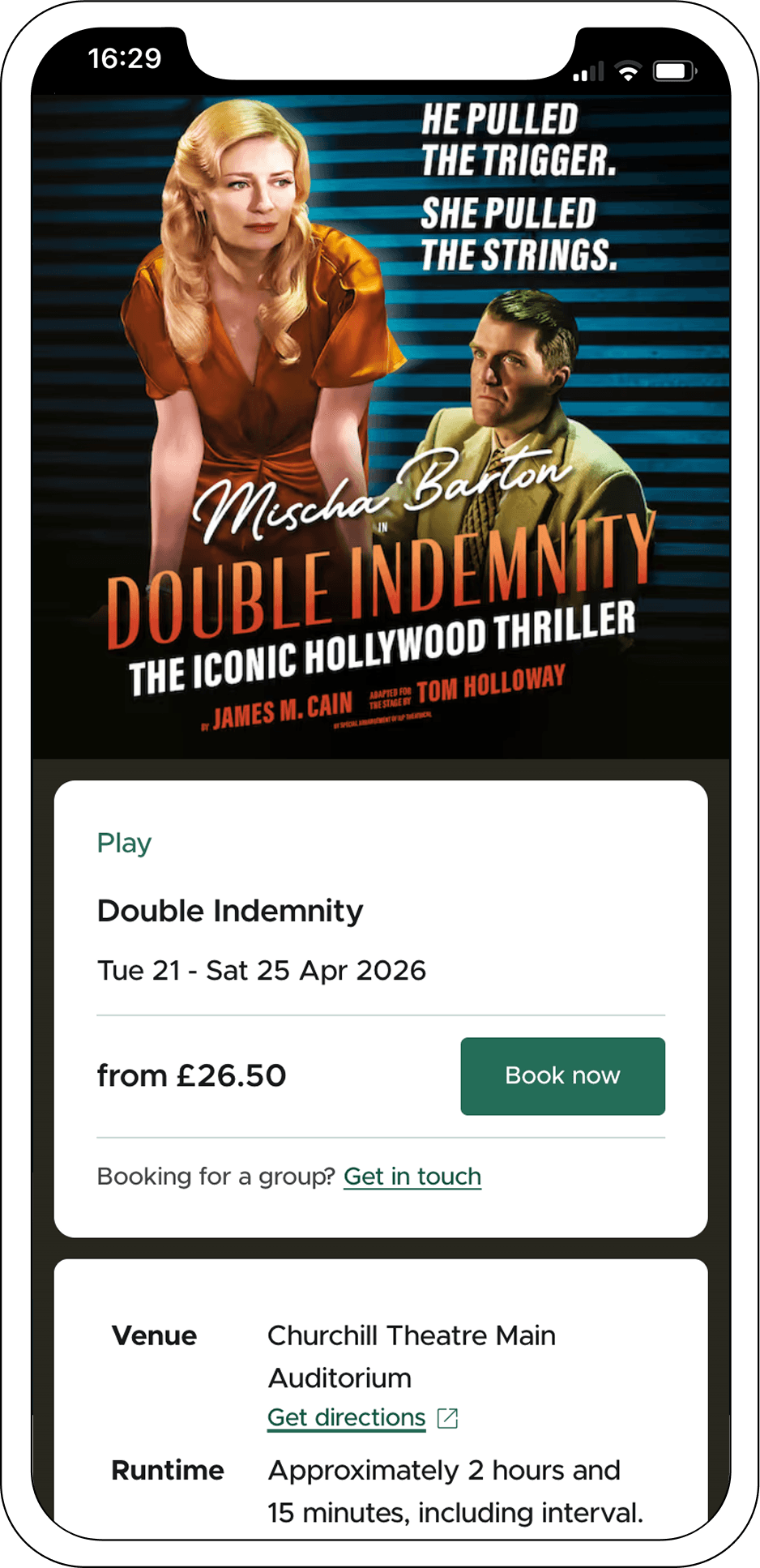
Structuring event pages
Event pages shifted from a flatter layout to a clearer booking journey, with key details surfaced earlier and supporting information organised more intentionally
outcomes
I led the redesign through to launch, supporting migration, rollout and team training to help the new platform settle successfully.
The result was not just stronger conversion and engagement, but a simpler platform behind the scenes, reducing CMS complexity, supporting smoother operations and moving key areas towards a more data-first model.
Pulling more information directly from the booking system created a safer foundation for future delivery across offers, curated collections and food and drink packages